Thursday, 17 October 2013


Wednesday, 26 June 2013


Monday, 24 June 2013
Completed Magazine Cover
 This is my completed magazine cover. It is like any other magazine cover, it has a main focus which is the actor which is in the film. It has a competition at the top which most magazines have and then adjacent to it, it has the month and year it was released. The title is nice and big and it is clear. In most magazine the main focus is over the bit of the title which my main focus is doing. It has a sub title across the back of the main focus it is noticeable and clear adjacent to it there is a list of action films of 2013 which magazines have. At the bottom of the screen there is 3 other subjects and a barcode most magazines will have these but the 3 stories are just snippets and it makes you want to pick it up and carry on reading it. The sticker which says 50 reviews inside this issue looks like a sticker but it isn't it is just made to look like that. Overall I think that my magazine looks like a typical magazine cover.

Basic Layout Design

Thursday, 7 February 2013
Ideas Work (Magazine Cover)

In this idea the main focus is on the the left hand side. With the main focus head being over the I of 'FILM'. A competition at the top and the the issue date and price both above the title. The barcode is at the bottom left of the magazine cover. Below the title there is a circle which will have '30 Must See Films of 2013'. Then next to that there will be a list of main interviews that will appear in this issue. At the bottom of the page there is a PLUS! with bullet points e.g. James Franco speaks about OZ The Great and Powerful.

In this this idea the main focus will be on the right hand side instead and the head of the main focus will go in between the 'E' and the 'W'. The competition and issue date and price is above the title. The circle will be next to the main focus and it will have in it '50 Reviews Inside This Issue'. The barcode will be at the bottom right hand side. On the opposite side of the barcode there will be a box with PLUS! in it and below it some stories that will be in the issue of the magazine e.g. Is Stallone Back To His Best. Above that there will be a short list of 'ACTION FILMS OF 2013' the list will contain Iron Man 3, Thor 2: The Dark World, A Bullet To The Head, The Last Stand etc.
Wednesday, 6 February 2013


Thursday, 24 January 2013


Completed DVD Sleeve

This is my completed DVD sleeve. It is like any other DVD sleeve it has on the front of it a main focus which is the main character, the title which is big a clear, it has a tagline, the stars of the film at the top of the sleeve and at the bottom there is bbfc rating and the DVD logo. On the spine of the DVD sleeve there is the title of the film like most DVD sleeves and the bbfc rating and the DVD logo. Then on the back there is a synopsis which most DVD sleeves have so for people who haven't seen it can read it and get the feel for the film, there is screenshots of other scenes in the film, a special features bar, a credit bar for telling people who produced the film and directed it etc, it has an information bar as well so people can know what region the DVD is and how long it is on for etc. It has a barcode which a DVD needs so that it can be bought and then it has the company who made the film and the bbfc rating and DVD logo.


Wednesday, 23 January 2013
Basic Layout Design & Ideas Work (DVD Sleeve)

This is a basic layout design of a DVD sleeve it has the measurement for a DVD sleeve, so when it asks me for what measurements I want when I go onto Photoshop I will know what to enter.

Thursday, 17 January 2013
DVD Sleeve Development

 I have created a film poster now I have created a DVD sleeve and I got the correct measurement for a DVD sleeve.
 I then added a black background because I wanted the back to be black.

I then added then same background as I used in the film poster and changed it from landscape to portrait.

I then added in the main focus of the DVD sleeve I put the image in the middle so that it is more noticeable on the poster it was on the left hand side.

 I then added the title above the character and added a drop shadow so that the title stands out more.
I then added in the title on the spine because most DVD sleeves have the title on the spine.

Next I added in the tagline under the title, originally I put it over the main focus image but it didn't stand out so I moved the position of it.

I added the stars of the films at the top of the DVD sleeve, but originally it was the same font as the title and it didn't stand out, so I changed the font and added a drop shadow.

I added a bbfc rating on the front, back and on the spine of the DVD sleeve.

I added the DVD logo on the front, back and spine of the DVD sleeve.


I added a barcode because all DVD sleeves need a barcode.
 I added an information bar which includes the running time, the region of the DVD, what language its in, if it has subtitles and the ratio of what the DVD plays at etc.
I added the logo of the company of who produced the film in this case it is 'Lionsgate'.
I then added a credit bar it includes the companies involved, the actors, producer, director, make up, music and fashion.


I added a synopsis because this gives a short brief story of what is going to happen during the film.
I then added a couple of screenshots of other things that happen during the film.

And lastly I added a special features bar including deleted scenes, audio commentary and behind the scenes. Most DVDs have special features so I added it so that it looked like a proper DVD cover.
Wednesday, 16 January 2013


Wednesday, 19 December 2012
Completed Film Poster

This is my completed poster.
The film poster is landscape.
The main focus of the poster is the hitman with the gun in his hand.
The title The Contractor is similar to the title of the film The Mechanic when you think of a contractor you think of a builder but what it basically means is when a hitman gets a job they call it a contract.
The tagline No Comprises means that he can not comprise himself if he does it is game over for him and no new start somewhere else.
The lighting is coming from the top middle and right.
The hitman being in an alleyway suggests that he wants to get around quietly and no be stopped and if he isn't spotted he will complete his mission of escaping from the agency.
The lighting on the hitmans back shows that he is wearing a suit and that suggests he is professional with his work.
You can not see the hitmans face because of the way he is positioned this suggests he doesn't want anyone to find him or know who he is.
The name in this film is Sir Ben Kingsley because he is a well known actor this will attract more people to come and see the film.
Also with Lionsgate making the film promotes it a bit because they have created a lot of good films.
Film Poster Development

Firstly I took some pictures of Adam because he is who I used for my poster.
I took about 4 pictures but this is the one I decided to use.
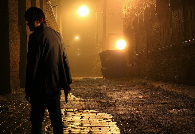
I then went onto Google to get a good picture for my background it took me a while but I eventually found this one which I thought was good.

Next I added in the main focus which is Adam in his suit.

Next I added the title onto my film poster where the beginning of the title is a small font and the second part of it is larger so it stands out more. I got the font from a website called da font.

After adding the title I added the tagline and I placed it under the title so that it was visible to see.

Then I added a BBFC rating of 15 and and I added the lionsgate logo because that is who created the film.

I then added a title bar at the bottom of the poster and this just tells you who did the music, costume, edit, produced and directed it.

Finally I added the actors at the top of the poster I put Adam's name, Ashley Roberts and Sir Ben Kingsley.
Subscribe to:
Posts (Atom)